


Why Some Buddhist Temples Use Red, Gold, and White Together
Why Some Buddhist Temples Use Red, Gold, and White Together
Quick Summary
- Red, gold, and white are often paired because they balance warmth, radiance, and clarity in one visual field.
- The trio works as a practical “attention guide,” helping visitors settle, orient, and behave respectfully without being told.
- Meanings shift by region and era; the same colors can signal devotion, protection, purity, or celebration depending on context.
- Gold frequently highlights what is considered most worthy of care—icons, altars, inscriptions, and key architectural lines.
- White commonly creates breathing room: walls, banners, or garments that soften intensity and support calm perception.
- Red can function as a boundary color—marking thresholds, pillars, and frames that shape how you move through space.
- Seeing the palette as a “skillful design choice” is often more accurate than treating it as a fixed code with one translation.
Introduction
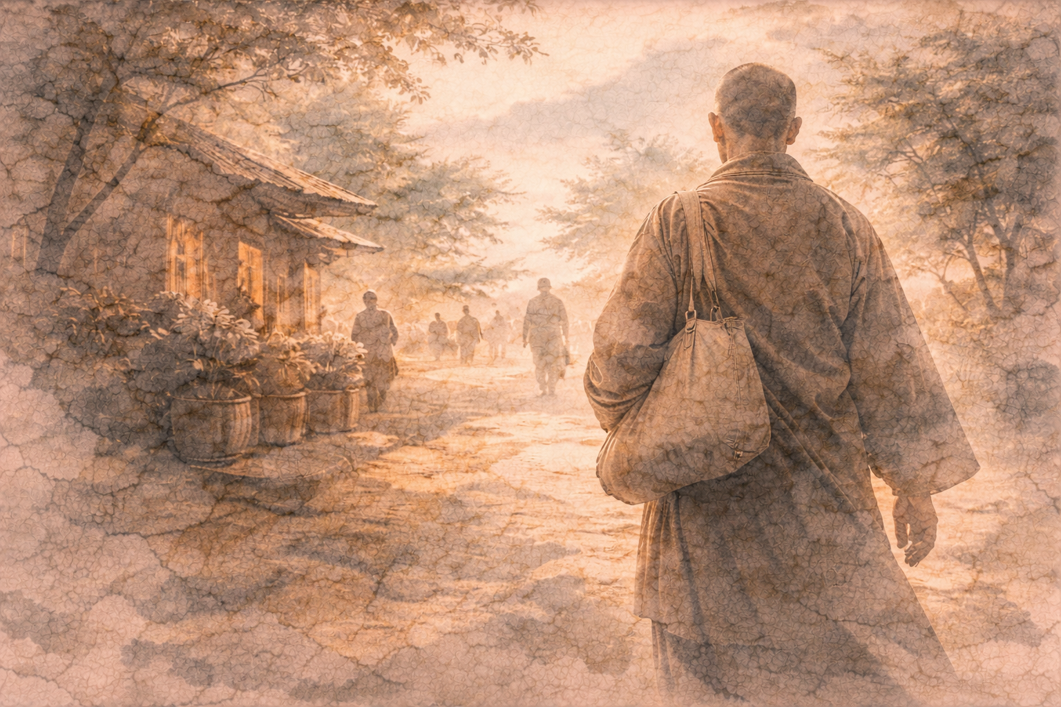
You notice it right away: a temple gate or hall where red beams, gold details, and white surfaces sit together so deliberately that it feels like it must “mean something”—yet every quick explanation online sounds either too mystical or too simplistic. The more honest answer is that these colors work on you in several layers at once: they shape attention, mood, and conduct, while also carrying local symbolism and craft traditions. At Gassho, we focus on how Buddhist spaces communicate through lived experience and careful observation.
When people search for “Buddhist temples red gold white,” they’re usually trying to decode a visual language: why these three, why together, and why they feel both festive and solemn. That’s a good instinct—temples are designed to be read with the body as much as with the mind.
GASSHO
Ask and learn about Buddhism in daily life.
GASSHO is a Buddhist community app where you can learn Buddhist teachings and ask questions to the head priest of Kongosanmaiin Temple on Mount Koya.
A practical lens for reading temple colors
A useful way to understand red, gold, and white in Buddhist temples is to treat them less like a secret message and more like a set of cues that shape perception. Color in a temple is not only decoration; it’s part of how the space “teaches” without words—directing your eyes, slowing your pace, and clarifying what matters in the room.
Red tends to feel close and immediate. It can make pillars, gates, and frames appear more present, almost like the architecture is stepping forward to meet you. In many temples, that sense of presence helps define thresholds: you are entering a place that asks for a different kind of attention than the street outside.
Gold reads as emphasis. It catches light, outlines forms, and signals care—like a visual underline. Whether it appears as gilding on a statue, a halo motif, an altar fitting, or a painted detail, gold often marks what the community has chosen to honor, protect, and maintain over time.
White, by contrast, often functions as clarity and space. It can quiet the visual field, making the brighter elements feel intentional rather than overwhelming. White surfaces, garments, or banners can also create a sense of cleanliness and openness—less as moral judgment, more as a practical atmosphere that supports composure.
How the red–gold–white palette feels in real life
When you approach a temple that uses red, gold, and white together, your attention usually lands on edges first: the red frames, rails, or columns. Without thinking, you start to track entrances and boundaries—where to step, where to pause, where not to wander.
Then the gold details begin to “collect” your gaze. A gilded ornament or a gold-lined carving doesn’t just look expensive; it looks cared for. Many people notice themselves becoming quieter at this point, not because they were told to, but because the space is already behaving as if something is being respected.
White often shows up as the part that lets your eyes rest. After red and gold pull you toward structure and emphasis, white gives you a place to settle—like a pause in a sentence. That pause can reduce the urge to scan for novelty and instead support steady looking.
This is where internal reactions become obvious. If you arrive hurried, the red can feel too loud, the gold too bright, the white too stark. But if you stand still for a moment, the same palette can start to feel balanced: warmth (red), radiance (gold), and openness (white) sharing the same space without competing.
In ordinary moments—removing shoes, washing hands, offering incense—you may notice how the colors guide behavior. Red marks the “do not cross casually” areas. Gold draws you toward the altar or icon. White keeps the overall scene from turning into sensory clutter, so small actions feel deliberate rather than performative.
Even photographs reveal this effect. In many temple images, red provides the skeleton, gold provides the highlights, and white provides the negative space. The result is a visual rhythm that makes the building feel both celebratory and restrained—an unusual combination that many visitors remember long after leaving.
Over time, you might also notice that the palette changes with light and weather. Gold warms at sunset, red deepens in shade, and white reflects whatever the sky is doing. The same three colors can therefore feel different across seasons, which subtly reinforces the sense that the temple is alive to conditions rather than frozen in a single mood.
Common misunderstandings about red, gold, and white
One common misunderstanding is assuming there is one universal code: red always means X, gold always means Y, white always means Z. In reality, temples inherit local aesthetics, materials, and historical influences. The same color can carry different associations depending on region, era, and even the purpose of a specific building within a temple complex.
Another misunderstanding is treating the palette as purely symbolic and ignoring function. Red pigments and lacquers have often been valued for durability and visibility. Gold leaf and gold paint can protect surfaces while also making fine details readable in low light. White surfaces can brighten interiors and improve legibility of forms and texts.
Some people also assume that “more gold” automatically means “more spiritual.” But gold is frequently a community choice about what to preserve and emphasize—an expression of care, gratitude, and continuity. It can be devotional without being a scoreboard of holiness.
Finally, it’s easy to miss that temples are layered spaces. A gate, a main hall, and an inner altar area may use the same three colors differently. The palette can be consistent while the emotional tone shifts from welcoming (outer areas) to focused (inner areas), simply through how red, gold, and white are distributed.
Why this color trio still matters today
Red, gold, and white endure because they solve a real problem: how to create a place that feels special without becoming chaotic. The trio can hold intensity and calm in the same frame—useful in spaces meant for gatherings, rituals, remembrance, and quiet personal visits.
For visitors, understanding the palette can reduce the anxious feeling of “not knowing what to do.” You can let the space guide you: pause at thresholds, move slowly where emphasis gathers, and allow the lighter areas to be places of composure rather than distraction.
For daily life, the lesson is surprisingly practical. You can notice how environments shape your mind without asking permission—how certain colors and contrasts speed you up, tighten you, or soften you. Temples use red, gold, and white as an intentional arrangement; you can borrow that idea by choosing what you want to emphasize, what you want to calm, and what you want to keep clear.
Conclusion
When Buddhist temples use red, gold, and white together, it’s rarely just decoration and rarely just symbolism. It’s a balanced design language: red establishes presence and boundaries, gold marks what is honored, and white creates clarity and room to breathe. If you read the palette as a set of cues for attention and conduct—rather than a single fixed code—the combination starts to make sense in a grounded, human way.
Ask a Buddhist priest
Have a question about Buddhism?
In the GASSHO app, you can ask questions about Buddhist teachings, daily concerns, and how to understand Buddhism in everyday life.
Frequently Asked Questions
- FAQ 1: What do red, gold, and white commonly represent in Buddhist temples?
- FAQ 2: Why do Buddhist temples use red and gold together so often?
- FAQ 3: What role does white play when a temple already has red and gold?
- FAQ 4: Are red, gold, and white colors universal across all Buddhist temples?
- FAQ 5: Do red, gold, and white in Buddhist temples have one fixed meaning?
- FAQ 6: Why is red used on gates and pillars at some Buddhist temples?
- FAQ 7: Why is gold used on statues and altars in temples with red and white?
- FAQ 8: Is white in Buddhist temples always about purity?
- FAQ 9: Why do some Buddhist temples look mostly red and gold, while others look more white and gold?
- FAQ 10: Are red, gold, and white used differently inside versus outside Buddhist temples?
- FAQ 11: Do red, gold, and white in Buddhist temples relate to specific rituals?
- FAQ 12: Is the red in Buddhist temples meant to be protective?
- FAQ 13: Why do red, gold, and white photograph so well in Buddhist temple architecture?
- FAQ 14: Can modern Buddhist temples still use red, gold, and white without copying older styles?
- FAQ 15: If I see red, gold, and white at a Buddhist temple, what’s the most grounded way to interpret it?
FAQ 1: What do red, gold, and white commonly represent in Buddhist temples?
Answer: They’re often used as a balanced visual set: red for presence and boundary (frames, gates, pillars), gold for emphasis and honor (altars, icons, key details), and white for clarity and spaciousness (walls, banners, garments). Meanings can vary by place and period, but the functional effect is remarkably consistent.
Takeaway: Think “attention cues” first, and “fixed symbolism” second.
FAQ 2: Why do Buddhist temples use red and gold together so often?
Answer: Red provides strong structure and visibility, while gold highlights what should stand out—especially in dim interiors or under changing daylight. Together they create a clear hierarchy: what is background, what is boundary, and what is central.
Takeaway: Red builds the frame; gold points to what the community honors.
FAQ 3: What role does white play when a temple already has red and gold?
Answer: White often prevents visual overload. It reflects light, opens up space, and makes red and gold feel intentional rather than crowded. In practice, it’s the “breathing room” that supports calm looking and steady movement.
Takeaway: White is frequently the stabilizer in the red–gold–white trio.
FAQ 4: Are red, gold, and white colors universal across all Buddhist temples?
Answer: No. Many temples use other dominant palettes (natural wood, black lacquer, greens, blues, earth tones), and some use red–gold–white only in specific buildings or ceremonial areas. Local materials, climate, history, and restoration choices all influence color.
Takeaway: The trio is common, not universal.
FAQ 5: Do red, gold, and white in Buddhist temples have one fixed meaning?
Answer: Not usually. People often want a single translation, but temple color use is layered: practical (durability, visibility), aesthetic (contrast and harmony), and symbolic (purity, protection, reverence) depending on context.
Takeaway: It’s better to read the colors as layered signals than a one-line code.
FAQ 6: Why is red used on gates and pillars at some Buddhist temples?
Answer: Red is highly visible and tends to “advance” visually, making structural elements feel present and clearly defined. On gates and pillars, it helps mark thresholds and guide movement—where to enter, where to pause, and what feels set apart.
Takeaway: Red often functions as a boundary and orientation color.
FAQ 7: Why is gold used on statues and altars in temples with red and white?
Answer: Gold catches light and draws the eye, which is useful for focal points like statues, halos, altar fittings, and inscriptions. It also signals careful maintenance and communal devotion—what is treated as worthy of special attention and protection.
Takeaway: Gold is often the visual “underline” of what matters most in the space.
FAQ 8: Is white in Buddhist temples always about purity?
Answer: White can be associated with purity in some contexts, but in many temples it’s also simply practical: it brightens interiors, increases contrast for readability, and creates calm visual space around more intense colors like red and gold.
Takeaway: White can be symbolic, but it’s often functional and atmospheric.
FAQ 9: Why do some Buddhist temples look mostly red and gold, while others look more white and gold?
Answer: The balance depends on architecture, restoration history, and local taste. Some complexes emphasize red structural framing; others use more white plaster or light surfaces to brighten halls, letting gold details carry the emphasis.
Takeaway: The same three colors can be “mixed” differently to create different moods.
FAQ 10: Are red, gold, and white used differently inside versus outside Buddhist temples?
Answer: Often, yes. Exteriors may use red to define structure and visibility from a distance, while interiors may concentrate gold around altars and icons. White may appear as walls, ceilings, cloths, or banners to manage light and keep the interior from feeling visually heavy.
Takeaway: Outside colors orient you; inside colors focus you.
FAQ 11: Do red, gold, and white in Buddhist temples relate to specific rituals?
Answer: They can. Gold often clusters around ritual focal points (altars, offering tables, icons), while white cloths or banners may appear during ceremonies, and red may frame processional routes or threshold areas. The palette supports ritual flow by making “where attention goes” visually obvious.
Takeaway: The colors often reinforce ritual movement and focus.
FAQ 12: Is the red in Buddhist temples meant to be protective?
Answer: In some cultural settings, red is associated with protection and auspiciousness, and temples may inherit those associations. Even without that layer, red still functions protectively in a practical sense by clearly marking boundaries and important structural elements.
Takeaway: “Protective” can be cultural symbolism and also practical boundary-making.
FAQ 13: Why do red, gold, and white photograph so well in Buddhist temple architecture?
Answer: The trio creates strong contrast: red provides saturated structure, gold provides highlights, and white provides clean negative space. Cameras (and eyes) read that contrast as clarity and depth, especially when light hits gold details.
Takeaway: The palette is visually legible, which is part of why it endures.
FAQ 14: Can modern Buddhist temples still use red, gold, and white without copying older styles?
Answer: Yes. Contemporary temples can use the same palette in simpler forms—clean white surfaces for openness, restrained red for thresholds, and limited gold for focal points—while keeping the overall design modern and uncluttered.
Takeaway: The trio can be adapted as a functional design language, not just a historical look.
FAQ 15: If I see red, gold, and white at a Buddhist temple, what’s the most grounded way to interpret it?
Answer: Start with what the colors do to your attention: red frames and slows you at thresholds, gold gathers focus on what’s honored, and white gives visual space to settle. Then, if you want deeper context, look for local history, restoration notes, or signage rather than assuming a single universal meaning.
Takeaway: Read the palette through experience first, and symbolism second.