


Why Buddhist Art Uses Color to Show Peaceful and Fierce Qualities
Quick Summary
- In Buddhist art, color is a visual shorthand for inner qualities: calm clarity and protective intensity.
- “Peaceful” and “fierce” are not moral opposites; they are different ways compassion can appear.
- Cool, open tones often signal steadiness and spacious attention; hot, saturated tones often signal urgent, cutting energy.
- Fierce imagery is frequently about removing obstacles (confusion, harmful habits), not promoting aggression.
- Gold, white, blue, red, and black each carry layered meanings that depend on context and composition.
- Color works with posture, gaze, gesture, and surrounding flames/halos to communicate the full message.
- Reading Buddhist art well means noticing your reaction first, then letting the colors teach you how to relate.
Why Buddhist Art Uses Color to Show Peaceful and Fierce Qualities
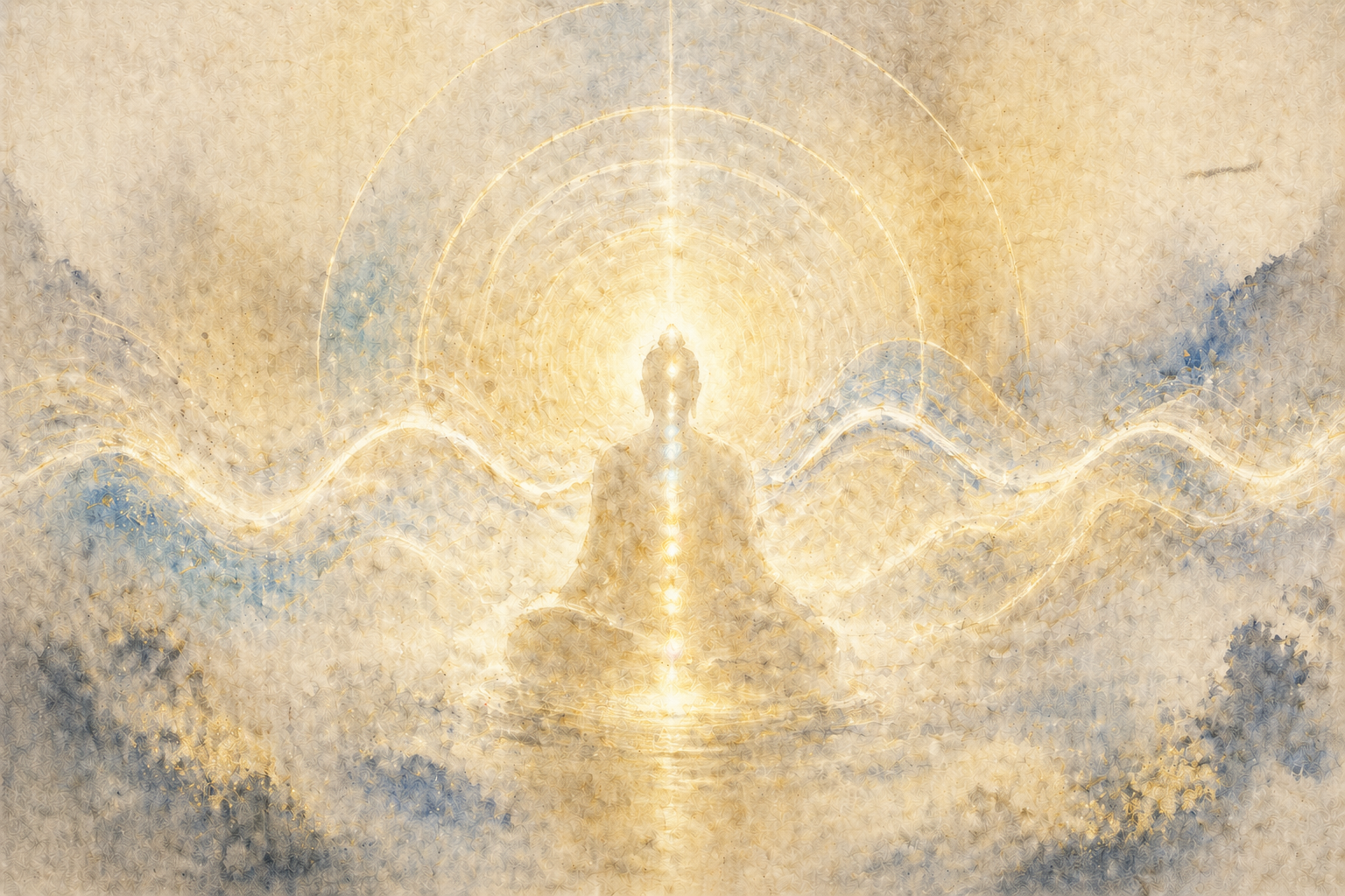
You’re looking at Buddhist art and the colors feel like a contradiction: one figure is painted in soft whites and golds that read as gentle, while another is drenched in reds, deep blues, or blacks with flames that look almost angry. The confusion usually comes from assuming color is describing personality, when it’s often describing function—how wisdom and compassion respond to different situations. At Gassho, we focus on practical, experience-based ways to read Buddhist symbolism without turning it into dogma.
Color in Buddhist art isn’t just decoration; it’s a way of training perception. It guides the viewer toward a felt sense of “peaceful” qualities like clarity, balance, and non-reactivity, and “fierce” qualities like decisiveness, protection, and the power to cut through confusion.
When you read the palette this way, peaceful and fierce stop being opposites. They become two expressions of the same intention: reducing suffering—sometimes by soothing, sometimes by stopping what harms.
GASSHO
Ask and learn about Buddhism in daily life.
GASSHO is a Buddhist community app where you can learn Buddhist teachings and ask questions to the head priest of Kongosanmaiin Temple on Mount Koya.
A Clear Lens for Reading Peaceful and Fierce Color
A helpful lens is to treat Buddhist art color as a map of qualities rather than a portrait of moods. Peaceful colors often point to stability and openness: the mind that can hold experience without tightening. Fierce colors often point to energy and precision: the mind that can act without hatred.
In this view, “peaceful” doesn’t mean passive, and “fierce” doesn’t mean violent. Peaceful imagery can be strong and unwavering; fierce imagery can be compassionate and protective. Color helps communicate that difference quickly, even before you notice details like hand gestures or ritual objects.
Color also works relationally. A single hue can shift meaning depending on what surrounds it: a cool blue beside gold can feel spacious and luminous; the same blue against red flames can feel intense and cutting. Buddhist art often relies on these contrasts to show how one quality becomes another when circumstances change.
Most importantly, the palette is meant to be read with your own nervous system in mind. If a color calms you, it’s doing one kind of teaching; if it startles you, it may be pointing to the exact place you cling, resist, or go numb.
How These Colors Show Up in Ordinary Experience
Think about how you respond to a stressful email. A “peaceful” response isn’t pretending it doesn’t matter; it’s the ability to read it without immediately tightening your chest and rushing to defend yourself. Colors associated with peaceful figures often echo that steadiness: light, open, and less visually “sticky.”
Now consider a different moment: you’re about to say something sharp to someone you care about. A “fierce” response can be the capacity to stop—cleanly, decisively—before harm happens. Fierce colors often mirror that decisive energy: saturated reds, deep blues, stark blacks, and high-contrast flames that feel like a clear boundary.
In daily life, peaceful qualities can look like staying with discomfort long enough to understand it. Fierce qualities can look like cutting off a spiraling thought pattern the moment you notice it. Buddhist art uses color to make these inner moves visible.
You can also notice how attention behaves. Peaceful palettes tend to invite a wider field of attention—your eyes rest, then soften. Fierce palettes tend to concentrate attention—your eyes lock on, then sharpen. Neither is “better”; they’re different tools for different moments.
Even the same color can teach different lessons depending on your state. Gold might feel warm and reassuring when you’re anxious, but it can feel almost exposing when you’re trying to hide from something. Red might feel energizing when you’re dull, but overwhelming when you’re already agitated. Buddhist art quietly asks you to notice that variability.
Over time, you may find that what first looked “scary” starts to read as protective, and what first looked “serene” starts to read as powerful. That shift isn’t about adopting a belief; it’s about learning to recognize how compassion can be soft or strong without changing its core intention.
Common Misreadings of Peaceful and Fierce Palettes
One common misunderstanding is to treat peaceful colors as “good” and fierce colors as “bad.” That moral framing misses the point: the art is often describing skillful response, not virtue signaling. A fierce palette can represent the refusal to cooperate with confusion, harm, or self-deception.
Another misreading is to assume color meanings are fixed like a universal codebook. While there are strong patterns, Buddhist art is also regional, historical, and stylistic. The same hue can carry different emphasis depending on the figure, the surrounding symbols, and the overall composition.
People also confuse “fierce” with anger. Fierce imagery can look wrathful, but the teaching is often about intensity without hatred—like a parent pulling a child away from danger. The heat in the palette is frequently about urgency and clarity, not hostility.
Finally, some viewers assume the goal is to feel calm all the time, so they gravitate only to peaceful images. But life includes moments when calm becomes avoidance. Fierce color can be a reminder that compassion sometimes needs a backbone.
Why This Color Language Matters Off the Gallery Wall
Learning how Buddhist art uses color to show peaceful and fierce qualities gives you a practical vocabulary for your own mind. You start recognizing when you need soothing (settling the system) and when you need clarity (setting a boundary, stopping a harmful loop).
It also reduces the tendency to judge your inner weather. If you feel intensity, you don’t have to label it as failure; you can ask whether it can be shaped into clean, protective action. If you feel calm, you don’t have to cling to it; you can ask whether it’s genuine openness or quiet avoidance.
On a relational level, this lens can soften how you interpret others. Some people express care through gentleness; others express care through firmness. Buddhist art’s peaceful and fierce palettes are a reminder that the same intention can wear different faces.
And aesthetically, it makes the art more intimate. Instead of “What does this color mean in general?” the question becomes “What is this color asking me to notice right now?” That shift turns viewing into a kind of practice: attentive, honest, and grounded.
Conclusion
Buddhist art uses color to communicate peaceful and fierce qualities because the path it points to isn’t one-note. Peaceful palettes often teach steadiness, openness, and clarity; fierce palettes often teach protection, decisiveness, and the power to cut through confusion. When you stop reading these colors as “nice versus scary” and start reading them as “soothing versus stopping,” the imagery becomes less mysterious—and far more useful.
The next time a fierce figure’s reds and blacks feel too intense, try asking what boundary you might be avoiding. And when a peaceful figure’s whites and golds feel comforting, ask what kind of steadiness they’re inviting you to embody.
Ask a Buddhist priest
Have a question about Buddhism?
In the GASSHO app, you can ask questions about Buddhist teachings, daily concerns, and how to understand Buddhism in everyday life.
Frequently Asked Questions
- FAQ 1: What does “peaceful” versus “fierce” mean in Buddhist art color?
- FAQ 2: Why do fierce Buddhist figures use red, black, or dark blue so often?
- FAQ 3: Are peaceful Buddhist art colors always pastel or light?
- FAQ 4: What does gold represent in Buddhist art when showing peaceful qualities?
- FAQ 5: Why do flames appear around fierce figures, and how does color affect that meaning?
- FAQ 6: Can the same color show both peaceful and fierce qualities in Buddhist art?
- FAQ 7: What do white colors usually suggest in peaceful Buddhist art?
- FAQ 8: What does red mean in Buddhist art when a figure is peaceful rather than fierce?
- FAQ 9: Why do some fierce Buddhist images use bright, jewel-like colors instead of dark tones?
- FAQ 10: Is fierce Buddhist art color meant to scare viewers?
- FAQ 11: How do background colors influence whether Buddhist art feels peaceful or fierce?
- FAQ 12: Do peaceful and fierce colors have one fixed meaning across all Buddhist art?
- FAQ 13: What role does contrast play in Buddhist art color for peaceful and fierce qualities?
- FAQ 14: How should I interpret a figure with a fierce face but peaceful colors, or peaceful face with fierce colors?
- FAQ 15: What is a practical way to “read” Buddhist art color for peaceful and fierce qualities as a viewer?
FAQ 1: What does “peaceful” versus “fierce” mean in Buddhist art color?
Answer: In Buddhist art, peaceful color schemes typically emphasize calm clarity and openness, while fierce color schemes emphasize protective intensity and decisive clarity. The contrast is usually about function—soothing or cutting through obstacles—rather than “good versus bad.”
Takeaway: Peaceful and fierce colors often describe different compassionate responses.
FAQ 2: Why do fierce Buddhist figures use red, black, or dark blue so often?
Answer: Red, black, and dark blue create strong visual force and contrast, which helps communicate urgency, protection, and the ability to confront confusion directly. These colors can signal “cutting energy” rather than hostility.
Takeaway: Dark, saturated hues often point to protective power, not aggression.
FAQ 3: Are peaceful Buddhist art colors always pastel or light?
Answer: Not always. Peaceful qualities can be shown with luminous golds, clear whites, gentle greens, or even deep blues when the overall composition feels spacious and balanced. “Peaceful” is more about the effect of the palette than brightness alone.
Takeaway: Peaceful color is about steadiness and clarity, not just lightness.
FAQ 4: What does gold represent in Buddhist art when showing peaceful qualities?
Answer: Gold often suggests radiance, value, and awakened clarity—an “inner light” quality. In peaceful imagery it can read as warmth and stability, making the figure feel steady and reassuring rather than dramatic.
Takeaway: Gold commonly supports a calm, luminous sense of clarity.
FAQ 5: Why do flames appear around fierce figures, and how does color affect that meaning?
Answer: Flames often symbolize intense transformation—burning through confusion, fear, or harmful habits. Hot colors (reds, oranges, yellows) amplify the sense of immediacy and power, while the figure’s body color (blue/black/red) can emphasize different “modes” of fierce clarity.
Takeaway: Flame colors usually point to purification and urgency, not punishment.
FAQ 6: Can the same color show both peaceful and fierce qualities in Buddhist art?
Answer: Yes. A deep blue can feel peaceful when paired with open space and soft gold, but fierce when paired with flames and sharp contrast. Meaning comes from the whole visual system: color, posture, expression, and surrounding symbols.
Takeaway: Context determines whether a color reads as peaceful or fierce.
FAQ 7: What do white colors usually suggest in peaceful Buddhist art?
Answer: White often suggests purity in the sense of clarity and non-staining—experience seen without being clouded by grasping. In peaceful depictions, white can create a feeling of openness, simplicity, and calm presence.
Takeaway: White commonly supports a sense of clear, unburdened awareness.
FAQ 8: What does red mean in Buddhist art when a figure is peaceful rather than fierce?
Answer: Red can indicate warmth, vitality, and engaged compassion even in peaceful imagery. When the face, posture, and surrounding elements remain gentle, red may read as “alive and present” rather than wrathful.
Takeaway: Red isn’t automatically fierce; it can also mean warm, active care.
FAQ 9: Why do some fierce Buddhist images use bright, jewel-like colors instead of dark tones?
Answer: Jewel-like saturation can communicate intensity and precision without relying on darkness. Bright contrasts can make the fierce quality feel vivid and awake—more like sharp clarity than gloom or menace.
Takeaway: Fierce color can be bright; the key is intensity and contrast.
FAQ 10: Is fierce Buddhist art color meant to scare viewers?
Answer: It can feel startling, but the aim is often to interrupt complacency and highlight protective strength. The “shock” is less about fear and more about waking attention up—like a visual reminder to stop feeding harmful patterns.
Takeaway: Fierce palettes often function as a wake-up call, not a threat.
FAQ 11: How do background colors influence whether Buddhist art feels peaceful or fierce?
Answer: Backgrounds shape the emotional “weather” of the image. Open, light, or evenly balanced backgrounds can support peaceful qualities, while high-contrast backgrounds, flames, or dense dark fields can heighten fierce qualities and focus attention sharply.
Takeaway: The background palette often sets the overall tone more than one single color does.
FAQ 12: Do peaceful and fierce colors have one fixed meaning across all Buddhist art?
Answer: No. While there are recurring patterns, color meaning shifts with region, era, materials, and artistic conventions. It’s best to read color alongside expression, gesture, and composition rather than treating it as a universal code.
Takeaway: Use color as a clue, then confirm meaning through the full image.
FAQ 13: What role does contrast play in Buddhist art color for peaceful and fierce qualities?
Answer: Contrast directs attention. Low-to-moderate contrast can feel spacious and settling (often read as peaceful), while sharp contrast can feel cutting and urgent (often read as fierce). Artists use contrast to shape how the viewer’s mind “lands” on the image.
Takeaway: Contrast is one of the fastest ways color communicates peaceful versus fierce.
FAQ 14: How should I interpret a figure with a fierce face but peaceful colors, or peaceful face with fierce colors?
Answer: Mixed signals are often intentional, showing that calm and intensity can coexist. A fierce expression with lighter colors can suggest protective strength held in clarity; a gentle expression with intense colors can suggest active compassion that engages the world directly.
Takeaway: When color and expression differ, read it as a nuanced blend of qualities.
FAQ 15: What is a practical way to “read” Buddhist art color for peaceful and fierce qualities as a viewer?
Answer: First notice your immediate bodily reaction (softening, tightening, alertness). Then identify the dominant palette (cool/open versus hot/high-contrast) and see how it matches the figure’s posture and surroundings. Finally, ask what quality the image is inviting: settling and widening attention (peaceful) or sharpening and setting boundaries (fierce).
Takeaway: Start with your reaction, then use color and context to clarify the message.